The Parabolic Stop and Reversal Indicator
The most popular technical indicators are the ones that indicate the start of new trends. Such tools allow traders to get in early in the emerging trend and ride the wave before sentiments change. Nevertheless, some indicators provide early warning signs of a potential change in the direction of price action.
The Parabolic Stop and Reversal is one such indicator that helps traders ascertain where a trend might end. The technical indicator comes with dots on the chart that indicates potential reversal areas. Whenever the indicator’s dots are below the candlesticks, it implies a Buy signal. Likewise, whenever the dots are above the candlesticks, it means a Sell signal.
A trend reversal occurs whenever the price moves above or below the price. For instance, whenever the price moves lower, the PSAR dots will always be above it. However, as the dots move below the price or candlesticks, it implies trend reversal affirming a change in sentiments from bearish to bullish.
Likewise, if the price were increasing, the PSAR dots would be expected to always be below the candlesticks. However, as the dots emerge above the candlesticks, it affirms a change in momentum from bullish to bearish. Consequently, it implies the end of the uptrend and the start of the downtrend.
How to Use PSAR to Exit Trades
The chart below shows Bitcoin’s rally at the height of the crypto boom in 2017. As the price raced to record highs of the time, the PSAR indicator was always below the candlesticks affirming the buy signal as part of the bullish momentum.
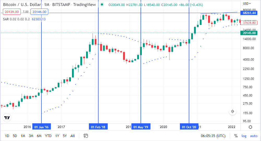
However, as 2018 started, the upside momentum showed signs of weakness. As soon the PSAR indicator dots emerged above the candlesticks, traders who were long the flagship cryptocurrency exited their position as the indicator affirmed the end of the uptrend. In addition, the dots above the candlesticks confirmed a change in momentum from bullish to bearish.
Bitcoin price ended up plummeting from highs of $20,000 at the end of 2018 to about $3,300 at the beginning of 2019. However, at the beginning of 2019, the downward momentum showed weakness, with the PSAR dots moving below the candlesticks.
With the PSAR dots below, Candlesticks in March asserted the end of the downtrend, signaling the start of the uptrend. Consequently, traders short the market exited their sell positions as the price increased.
Exponential Moving Average 200
THE Exponential Moving Average of 200 is a moving average set with a period of 200. Traders use the indicator to identify the underlying trend or the direction of price moving at a given time. In addition, the technical indicator allows traders to identify trends as they start and exit the market whenever there is a trend reversal.
The main principle while using the indicator implies a downtrend whenever the EMA 200 indicator is above the candlesticks. In this case, prices will continue moving lower, given the bearish momentum. On the other hand, whenever the price is above the EMA 200, it implies bullish momentum, with prices expected to rise.
The steeper the EMA 200 is, the stronger the trend, either to the upside or the downside. On the other hand, whenever the indicator is flat, moving sideways implies the market is in a range with bullish and bearish momentum at equilibrium.
How to Trade Using EMA 200
The chart below shows Ethereum price action between July 2021 and July 2022. Between July 2021 and January 2022, it is clear that the EMA 200 was below ETHUSD price, affirming uptrend. In this case, ETHUSD made higher highs as traders bought the coin.
Whenever sellers tried to push prices lower, they experienced strong resistance from bulls that came into the fold and instigated a buying spree. Likewise, whenever the bears tried to trigger lower prices, they came under pressure from bulls that came into the fold and pushed prices higher.
Consequently, traders resorted to opening buy positions with every slight pull back.
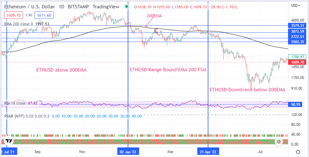
In early January, the price moved below the EMA 200 and broke out of the uptrend. However as short sellers tried to push prices they experienced strong resistance from bulls who pushed price back up. The back and forth between buyers and sellers resulted in ETHUSD remaining range bound.
Eventually, short sellers overpowered bulls in April 2022 resulting in price closing below the EMA200 and edging lower with force. Every time that buyers tried to fuel a bounce back they came under pressure with ETHUSD tanking significantly.
The EMA 200 has since emerged as a strong resistance level. As a result, any attempt to try and push the price above the EMA 200 has experienced strong resistance, with bears coming into the fold and assuming control.
Moving Average Convergence and Divergence Strategy
The Moving Average Convergence and Divergence is a moving average indicator used to provide insights on the underlying trend and the direction in which the market is likely to move. It consists of two moving averages.
The first one is a faster-moving average that responds much faster to price changes and is often referred to as the MACD line. The second is a slower moving average that takes time to react to price changes, often referred to as the Signal line.
In addition, the histogram shows the strength of the momentum either to the upside or the downside.
The MACD working principle is straightforward. Given that there are two moving averages with different speeds, MACD is a reliable indicator for predicting new trends. For instance, whenever the faster moving average or the MACD line crosses and moves above the slower moving average or Signal Line, it implies the start of an uptrend.
The MACD line moving away from the signal line affirms a buildup in buying pressure. During the uptrend, the histogram will appear above the zero line and increase in size as the bullish momentum increases.
In contrast, whenever the MACD line moves below the Signal Line, it implies the start of a downtrend. The MACD line moving further away from the signal line asserts the buildup in the selling pressure. In this case, the histogram will appear below the zero line and increase in size to the downside as the downward momentum increases.
How to Trade Using MACD
The chart below shows the MACD indicator below the EURUSD chart. The graph clearly shows that whenever the faster-moving average moved above the slower-red-moving average, it marked the start of an uptrend.
Consequently, buyers used the opportunity to enter long positions, pushing prices higher. As a result, the histogram increased in size as the upward momentum increased. Likewise, the histogram size decreased in size as the upward momentum waned.
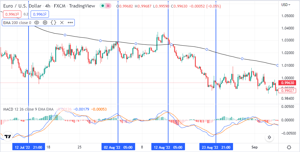
Similarly, the MACD asserted the start of a downtrend when the MACD line or faster-moving average crossed the Signal line or slower-moving average and started moving lower. The size of the Histogram below the zero line increased as the downward momentum increased. Likewise, the histogram size decreased below the zero line as soon as the downward momentum faded.
PSAR + MACD + EMA Strategy
Using the PSAR, MACD, and EMA 200 indicators concurrently increase the prospects for the best trading signals. In this case, the MACD and EMA 200 would provide reliable signals on the start of a new trend, while the PSAR would give early warning signs of a potential trend reversal needed to exit a given position.
A trading setup incorporating the three indicators would always lead to some of the best trading outcomes.
Entry Conditions for Buy Signal
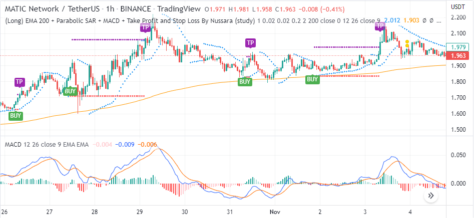
A buy signal would only come into play whenever the price rises above the EMA 200, as it affirms the market is trending up. The chart above shows that Tether is above the EMA 200 moving average, proving that bulls are in complete control. However, that does not mean one can open a buy position at any given point. In this case, the PSAR and the MACD are relied upon to pinpoint the ideal levels to open long positions.
A perfect entry level for a long position would come into play when the Blue MACD line moves above the Red Signal Line in the MACD indicator. The crossover underscores the start of a new uptrend even if the EMA 200 affirms the market is in an uptrend. The PSAR dots appear below the candlesticks when the MACD crossover occurs only goes to confirm the start of the uptrend.
Consequently, traders used this opportunity to enter a long position, as depicted on the Chart about October 28. Therefore, to enter a long position price must be above the EMA 200, the PSAR dot must be below the price, and the MACD line must move above the Signal Line in the MACD indicator.
A trader can remain long if a price is above the PSAR dots. However, as soon as the PSAR dots emerge above the price, it implies the end of the uptrend. Consequently, this would be the best time to exit the market. The MACD line moving below the Signal Line only goes to affirm the end of the underlying uptrend.
Entry Conditions for Short Positions
Likewise, with the help of the PSAR EMA 200 and MACD indicator, it is possible to ascertain ideal levels to enter short positions.
The earliest indication for short entry conditions is when the price is below the EMA 200. Price action oscillating below the EMA 200 affirms bearish momentum asserting bears in control. The chart below shows that price is moving up and down but below the EMA 200.
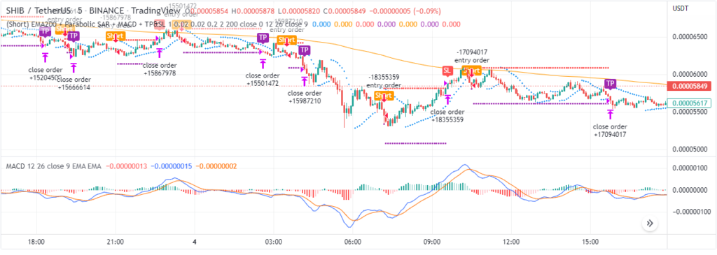
Once it is clear that the market is in a downtrend, the next step is identifying the ideal levels to enter sell positions. With the EMA 200 acting as a strong resistance level, any price bounce back to the EMA should always be a point of interest. Whenever the price is near the EMA 200, traders should always look to enter short positions if it does not move above.
Whenever the price fails to move above the EMA 200, the focus should shift to the MACD indicator for a sell signal. The chart above shows that at about 1100 hours, the MACD line Blue crossed the Signal Line Red near the EMA 200. What followed is the price moving lower. The PSAR confirmed the end of the previous uptrend by moving above the price.
Consequently, traders should always look to enter short positions if the price is below the EMA 200, the MACD line crosses the Signal Line from above and moves lower, and the PSAR dots are above the price.
The stop loss or the level to exit the market should be whenever the PSAR dots move below the candlesticks after a move lower. The take profit level with the setup would always be the level where the PSAR dots change course and appear below the candlesticks.
Bottom line
The MACD, PSAR, and EMA are some of the best technical analysis indicators for gaining an edge in predicting price action. The EMA affirms the direction the market is likely to move while the MACD asserts the ideal entry levels to open positions. On the other hand, the PSAR provides warning signs on the perfect time to exit.