Using Death Cross in Your Trading
The initial significance of the pattern was observed way back at the beginning of the 19th century when it preceded various bearish markets.
While the death cross is an indicator of a long-term bear market, there can be instances where its significance can wither. Understanding the moving averages and related market information can help you increase your winning chances through the right entries and exits.
The latest market developments have made it easier to spot death cross patterns. Now you can simply set up an alert on your trading platform whenever the 50 MA crosses over the 200 MA. Some traders may confuse themselves with the moving averages they should use. While the SMAs are better for long-term predictions, they are suspected to spikes. A combination of SMAs and EMAs might be fruitful in this case.
All traders should know how death crosses work so they can act quickly if needed during bearish markets. Before proceeding over to the main stuff, let us summarize the possible pros and cons of using a death cross:
Pros
- A solid indicator to benefit from the bear market
- It can be coupled with various indicators to trade
- Easy to identify on the charts
Cons
As MAs are lagging, the overall downtrend may already be over once you enter
Time Frame and Death Crosses
As the death cross is a price action indicator, its effectiveness can vary depending on the time frame. A death cross on the daily chart might be a simple bearish candle on the monthly interval. Some investors are seen using the MAs at different time intervals on the Trading View charts. The settings can be adjusted from the indicators tab.

Image 1. The better charting technology allows traders to tweak multiple settings for the moving average indicator. The time frame, offset, source, and lengths can be individually customized for observing the death cross.
Possible Stages of the Death Cross
The death cross can take significant time before appearing on the charts. This is because moving averages have a higher period, which consumes time for building up a crossover. All in all, we can divide the pattern into three stages:
- First phase. A long-term up trend precedes the death cross. This builds momentum for the shorting stage, resulting in the MA crossover. The uptrend indicates that the bulls are in control, and a reversal may be imminent.
- Second phase. The market will start facing some resistance to the long trend. It will begin ranging or show abrupt candles predicting that a sell-off might be in place. This also allows the lagging moving averages to catch up with the candlesticks, previously at a vast distance.
- Third phase. The moving averages cross over, and the market begins its sell-off. Some investors might wait for further clarification before taking a short position.
Some investors may also classify the crossover into the second stage and the dominant downward trend into the third one. While this may boil down to personal preference, the basics of the death cross remain the same.
How many days can it take for a death cross to show?
The number of days required for a death cross to complete its cycle can be acquired from the number of candles on a respective time frame. The period may be shorter for volatile stocks due to their increased up and down movements. As mentioned before, the time frame can also significantly impact the observations.
Combining Death Cross with other indicators
Taking an appropriate entry is vital for your short-term and long-term trading success. Price action traders combine multiple trading indicators to get confluence on their trades. Complete automation is also possible by developing your own moving average algorithm that trades on cross-overs. Risk management and moving average settings can be configured as per liking.
Moving averages and Death Cross
While this may sound strange, it is possible to combine several moving averages with the current 50 and 200 MAs. The 9 and 21-period EMAs can hint at the incoming 50 and 200 cross-overs as they are more likely to adapt to the recent changes.
Even after the crossover, the lower period MAs can be used to spot recurring entries. This can be highly beneficial for traders who have missed the initial entry and are looking to enter the current bear market.
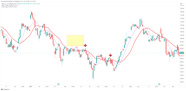
Image 2. The yellow box in the image highlights the point of the 50 and 200 MA crossover. After the initial entry pointed by the red arrow, it may seem vague to enter the market again. However, the 9 and 21 MAs can be utilized to highlight the next bearish trend. Using proper stop loss and take profit, it is possible to attain a 1:1 risk-reward in this scenario.
RSI and Death Cross
RSI is a popular indicator that is generally implemented to identify overbought and oversold conditions in the market. The question that may come to your mind is what RSI can do to help out on trading the death cross. From the previous paragraph, we remember that the death cross has three stages. RSI can play an essential role in the first phase by identifying the overbought conditions, which is the prerequisite for a death cross.
Moving on to the bear phase, we can still look out on the RSI to see if we are shorting the stock at a decent point. Selling when the Relative Strength Index is screaming oversold can result in a straight loser.
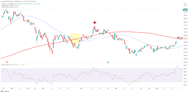
Image 3. Just before the Tesla earnings and revenue on 26 April 2021, the stock went through a death cross on the four-hour chart. The RSI Indicator, on the other hand, shows that the company is slightly oversold in the area. An educated investor using the Relative Strength Index would wait for the indicator to show an overbought signal before taking a short trade.
Fibonacci and Death Cross
Fibonacci intervals are an excellent way to measure the series of phenomena occurring before and after the X-shaped pattern. A death cross to develop on a candlestick chart should go through multiple retracements, which are entry opportunities for market participants.
The vital Fib levels that can go with the measurements are 38.2%,61.8%,-27%, -61.8, and 120%. After the death cross, take out the Fib indicator and measure the candlestick retracements for the previous uptrend. As the stock falls, it will rest on the -27% and -61.8 levels.
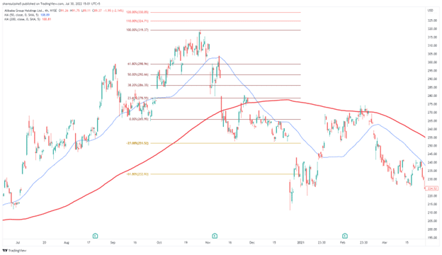
Image 4. Using the Fibonacci intervals, we measure an uptrend pre-death cross. Notice how the price action rests on the -27% levels before moving downwards.
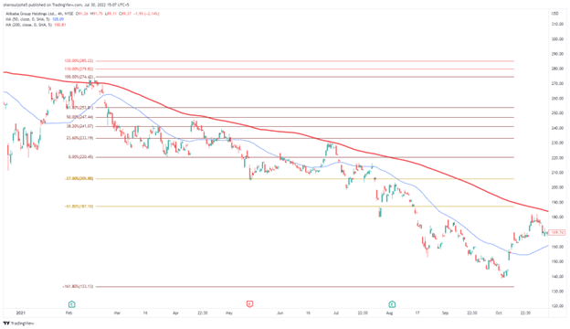
Image 5. A complete H4 chart on BABA shows the dominant downtrend which occurs after the death cross. The trader measures the pullbacks using the Fibonacci indicators. The -161.8% levels are major support and push the price closer to the 200 MA.
Bollinger Bands and Death Cross
The volatility measured using Bollinger Bands can be used to see if the current crossover has the momentum and power to continue into a long-term short trend. While it may clutter the chart as the death cross already has 50, and 200 MAs, traders have the option to hide the indicators after they measure the ups and downs of the price.
A wide distance between the two bands and a death cross would indicate that the market is falling with force. The pullbacks, later on, may provide further entries. While trading death cross using BBs, keep an eye out when the price is volatile near the 200 MA during the retracements.
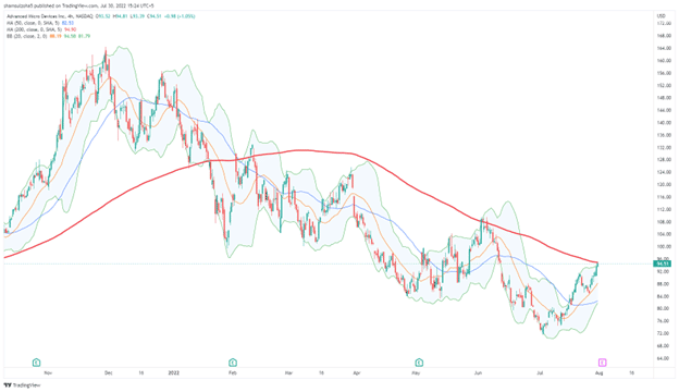
Image 6. The AMD stock is recently suffering a setback after the death cross on 03 February 2022. The gap between the two bands pre cross over shows the force with which the sellers are planning to take over. Here the market structure depicts lower highs and lower lows contributing to a downward trend.
Candlestick Patterns and Death Cross
As the death cross is a sign of a bearish market nature, it can be combined with bearish candlesticks such as engulfing patterns, shooting stars, evening stars, tweezers, and harami. It is best to look out for these candles on a higher time frame and then confirm your death cross on a lower chart. From our previous statement, we can recall that a bearish engulfing pattern on a monthly time frame can be a simple death cross on lower charts.
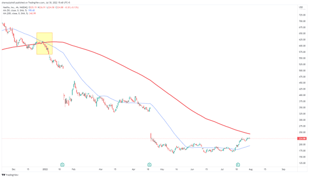
Image 7. The death cross on the 4-hour chart on NetFlix actually served as a death for the stock. It fell from an all-time high to pre-pandemic levels.
Let us dive into the lower time frames to see how the price action develops there. We can expect to see a large number of bearish candles.
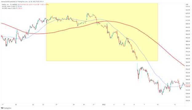
Image 8. Diving onto the 15-minute chart, we can observe the yellow area, which was the death cross on the 4-hour chart. From here, we see that the market clears out an M15 support level and faces a similar death cross as the H4 time frame.
Fundamentals and Death Cross
A bad earnings report from a company can lead to a sudden sell-off. On the charts, you may see big red candles or a 50 MA crossing over the 200 MA, i.e., the death cross. A death cross before a poor earnings report may also paint a negative picture in some instances.
Death Cross and Other Instruments
The implementation of the death cross has been mainly limited to the stock market. However, we can extend it to other markets such as currencies, futures, bonds, etc. Before using it out, backtest the crossover manually or automatically.
Image 9. Can you notice a fake death cross on the daily chart at EURUSD?. The market shows a slight hesitation before finally giving itself away to the sellers. The death cross gave rise to one of the biggest downtrends on the currency pair, which resulted in the levels observed in the late 90s and the early 2000s. Similar to EURUSD, you can also plot out the death cross on Bitcoin and other currencies.
Managing Risk while Trading Death Cross
New traders are advised to use proper risk management as there is no 100% winning strategy in the market. Death crosses may have a better winning rate but are subject to fake-outs. If the price does not turn in your favor, make sure there is a stop loss in place to avoid huge drawdowns.
As death crosses lead to long-term sell trends using a trailing stop loss can help you secure better profits while staying in the position. Closing out a portion of your trade is also a sound strategy.
Summary
The art of technical analysis may be complex to grasp but can be used on various instruments with ease once understood. Death Cross is one of the oldest indicators of the bear market, which has been holding its ground in recent years. It goes well with other algorithms and has the potential to provide good profit. The only disadvantage is that moving averages are a lagging indicator. However, this drawback can be covered using late entries at pullbacks.
Read more: